
The First House
What is the first house in astrology?
The house that begins the entire interpretive journey for us astrologically holds with it a few keys. HELLO, welcome to the fun house of you, let’s get rowdy. One of those keys is called our Rising Sign, or ‘ascendant’. What starry constellation of the zodiac was on the horizon while the sun was rising at your time of birth? Hence the nature of the name in reference, this group of stars is in direct correlation to an exact sign which holds with it a key identity to many doors (locked or open, you tell me honey) to your personality. It is important because the sun was shining through that constellation. Casting a design of characteristics and physicalities onto your actual appearance. That’s right, it shaped how you looked a bit! (or a lot, depending on if any planets are conjunct, next to, this ‘AC’, or Ascendant which is another term used for the rising sign.)

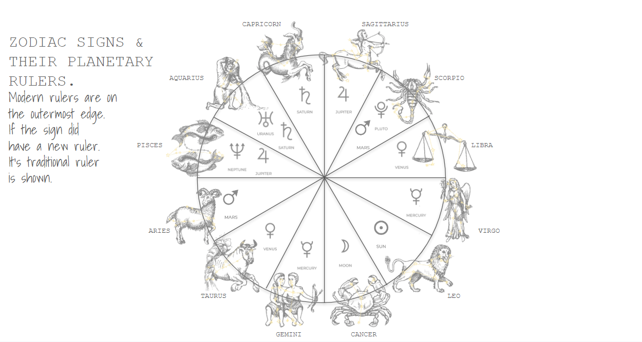
This specific sign in fact rules the sunrise of your birth, and therefore gifts you with certain birthday presents, if you will. Gifts with certain natures akin to what that sign governs astrologically. What it governs ties greatly in ways to the planets that tie into their rulership. There is a domain for everyhting in astrology. If you didn’t know, each sign of the zodiac has a planetary ruler. Some may even have two (hewwl’yeah). This is because over history and the discovery of new planets, to my knowledge, some signs shifted from their traditional planetary ruler, to a modern planetary ruler. Scorpio, traditionally ruled by Mars, is also ruled by Pluto when it was discovered. Making Pluto its modern ruler and Mars its traditional ruler. The same can be said about Aquarius, traditionally ruled by Saturn, and modernly ruled by Uranus. The more you know about these planets and the nature of the zodiac sign historically and mythologically will give you greater insights to why they are paired with one another. See below for a list of planets and the zodiac signs they rule.
The gifts in your appearance also have a relation to what part of the human body the 12 zodiac signs rule. Yes, if you didn’t know the signs of the zodiac actually rule a part of the human body. So, the sign that rules your rising will make this part of you unique or it will be more noticed, or even more beautiful, subjectively so. See below to see what signs rule what parts of the human body. How you look, come off, or appear is greatly influenced and affected by this once in a lifetime planetary movement that happened at the exact time of your birth. It captures a snapshot of the sky where everything freezes for just one second (or two). Since the sun shines bright, illuminating and penetrating, this imprint of the zodiac will cast deeply influential shadows to what lies within and where. Because with this sign, you stop the rotation of the planetary world, and begin to see what your first theoretical house in life is, what it’s made out of.
With this key, you get one other key, spoken of briefly just now, and that is your planet(s) that you just had found out that rule your rising sign. It is important for some zodiac signs to acknowledge the modern and traditional ruler of the sign because it is almost like having an extra key. You need to locate where that planet exists is in your chart (what house) to see how your rising sign is influenced or may show up a lot more significantly in your life. So, for example, if you are an Aquarius rising, you have 2 additional keys, one is Saturn and one is Uranus. So you need to locate Saturn, and also Uranus, what house do they fall into? What planets are not to it? Those houses are also now more significant to you and your path in this life. You will feel more seen and pronounced or focused in those houses (either consciously or subconsciously). Then you can take it a step further and look to see if there are any other planets next to Saturn or Uranus. Planetary proximity is important, it creates aspects, or influences. I will not get into aspects in this blog post. Maybe another time.
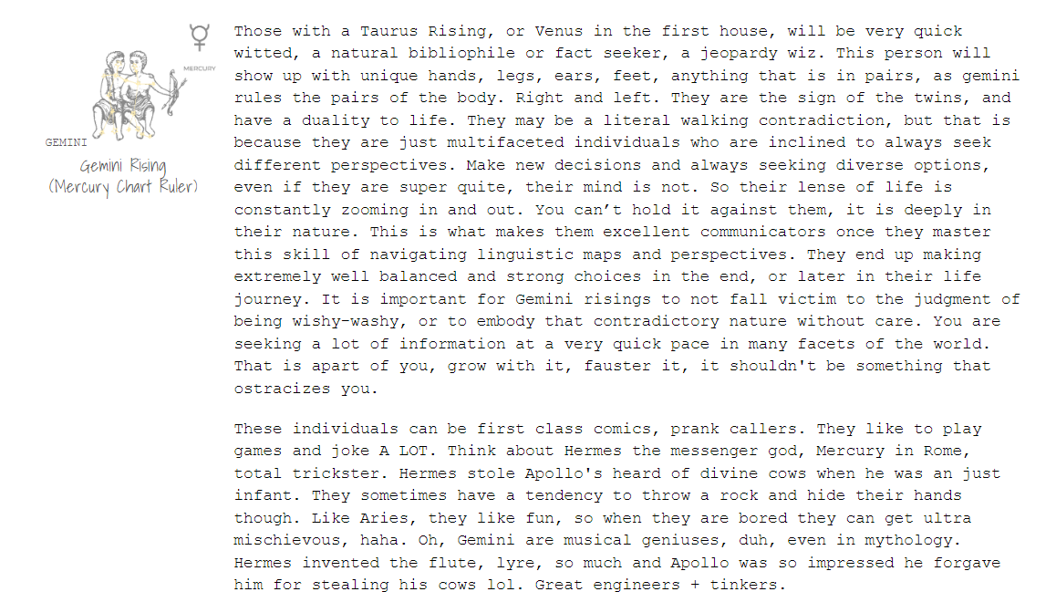
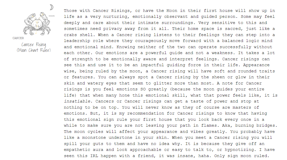
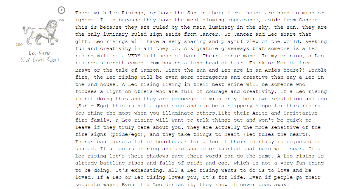
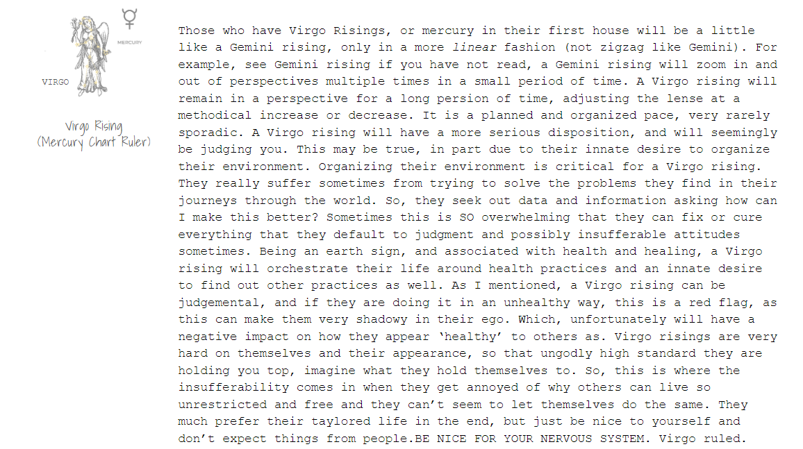
Another important rule to know in astrology is that there are 12 houses in astrology. These 12 houses symbolize 12 phases of human life. The 12 phases of human life connect, of course, you guessed it, with the signs of the zodiac. There are 12 zodiac signs and 12 houses (we are not counting Asclepius/Ophiuchus, unfortunately). The first zodiac sign is Aries. Therefore, Aries rules the first house of an astrological birth chart. Taurus is the second sign and rules the second house, ect., the second house will be covered in the next blog post.
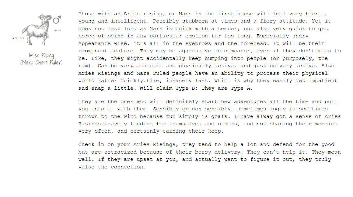
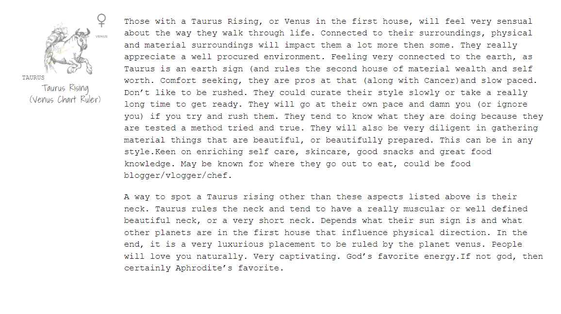
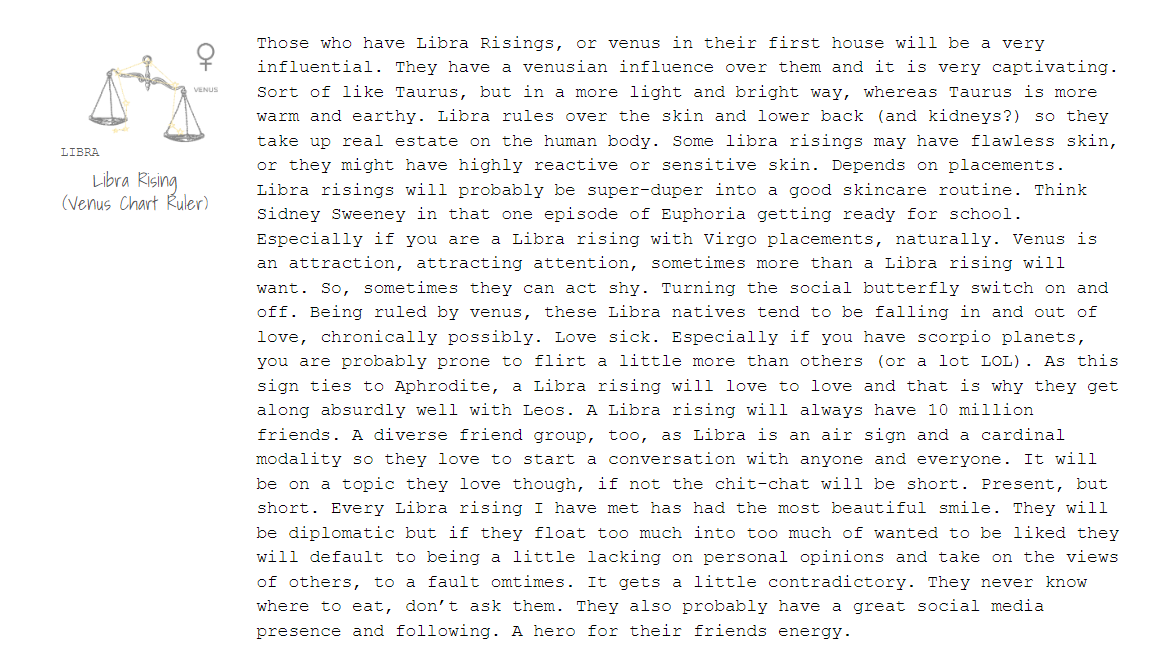
As we learned above, Aries is ruled by the planet Mars. Thus, the first house will indeed take on a lot of Aries qualities and martian qualities! For example, being the first, gut instincts and jumping in head first no second thoughts (Aries rules the head). The first house is therefore elementally a fire house. Aries is the first of the 3 fire signs (Aries, Leo, Saggitarius), so there is a ferocious zest to this house. It is a zest for life, the beginning of the fool's journey, the excitement and walking straight into the bliss of the unknown. Taking the lead. So, your first house also shares how you can take the lead, how do you naturally jump into a position of leadership? If you are a Taurus rising, then you break into leadership through pure and unwavering diligence, zero distractions, not caring who is competing with you. That is how you can show up and be a self elected leader, or naturally step up to the plate. You will most likely show up and wish to lead without caring of competition, you are the tortoise, they are the hare. We all know the story.
Now that you have found your rising signs planetary ruler(s), using your time of birth and maybe this blog post, give yourself a pat on the back! You just found the planet that rules your ENTIRE life. Which means, if you are a Gemini rising, mercury just became your BFF. Think of mercury as your clingy sibling that you can never seem to get away from, so, you best just embrace them. If you are an Aquarius, Capricorn, Scorpio rising, I AM SORRY. No, it’s not that bad, (I myself am capricorn rising). Having Saturn or Pluto rule over your entire life should be fine. Right? Well at least you will learn a lot! Make sure to mess up a lot, it helps. Truly. In fact, while reading this you're probably effing up right now in some way. I’m proud of you. Keep it up. Don’t be too hard on yourself.
I have made a list below of what each sign in the first house means to me. It is my translation after researching the meanings and understandings of what I had just mentioned above and knowledge over the years studying astrology.


Fuseastry
What is it?
In the process of gathering my own style and design language, I’ve been busy! Floating above and through numerous ideas I loved during steps in my career. It all boiled down to the why. To figure out why I liked a design, style or element. All of which led me to question who I was as an individual. Who on earth am I?! Why do I like this!? No one else does!; yet everyone likes this other thing I like…does it make that one better? Why am I asking this?! Leave it to a creative to go all ‘existential’ with their thought process. I highly recommend it though. The feeling was as if I were finally deciding to be a child again and listen to what I had to say instead of ignoring myself and just do what I was told. It was a high and low process. Confusing at times. Honestly, after going through it, I don’t see how there would be any other way to break out of the ‘entry of design’ fog.
Comparison, self-conscious thoughts, goals to please others— I was on a slippery slope to be a ‘safe choice’ in a way I perceived safe to be at the time. (Which was actually not safe I will share more later). Safe choices make the money honey! They really do, because we are humans who actively seek safety consciously, subconsciously, even super consciously. Yet, what makes something safe? If you know me, my design style isn't really the ‘safe choice’ at a glance, or the popular option in my viewpoint— or the ‘The Stanley Cup’ of interior design as a friend and I concluded together (you know the cup, not the hockey one). In the beginning of designer soup, I cursed my focus of theory on this of me being too risky or wild in design. Was I too impractical? So, I became very ‘practical’ in designs and approach. It was not right; it wasn't the problem. It may have never been. It also was fking bland, so I had to do something. I have to change my approach in conveying the perceived ‘unsafe ideas’, where you really take a risk. Because you know who you are. The ‘unsafe’ idea was safe to me because I knew them and what they were derived from (me actually knowing I liked it without bias) and that they are so beautiful. I have to find a way to explain this approach!! So, what was it then? How can I share with others how to make it safe to them, known to them? How is safe in today’s world conjured? A ‘safe bet’ is the ‘popular choice’ and when you stick with the popular choice, you rest assured that it’s a pretty safe bet. Right? Because everyone is in on it. That is the sense of connectedness, the safety that it’s popular. Yet, to me, after discussing with a very close friend of mine, Amber Jenkins of HomeBabe, safe and popular sit at the same table many times.
How do you know when the table isn't where you want to be sitting anymore? Maybe you even never wated to sit there. Putting your bet on something that is perceived as safe, like a popular trend, without knowing how it connects you to me is very unsafe! You lose it’s connection quickly because when it fades, trends fade, but you still are sitting surrounded by those safe choice items yet completely disconnected from your immediate surroundings. The other side to this is the trend dosent fade, but you become disconnected from it and begin to get an ick, becuase you woke up to how disconnected you are to these things in actuality. Then was the choice safe in the long run? It’s just the knowing. That is what makes design safe. Internal knowing is the safe bet. If you don’t know what you like and just conform, then there is an ick. It’s not authentic to you. You’re disconnected from it. Now when the trend fades, because the safe connectedness of that style fades with the wave it came in on, you feel maybe not utterly unsafe, but not secure with your choice. All the while you stay alongside it, without a connection, just an ick. So, knowing who you are is always the safe bet! So let me show you a method I use to make my most authentic concepts as a sure thing while conjuring the most epic version of my unique style. Which is actually pretty easy if you give it a try!

I felt like I had to get the ‘ick’ or the ‘gunk’ out of my mind that I was picking up while being a baby magnet of design. I think everyone needs to do this, not just designers, everyone. It’s why people hire designers because it’s that time and eye that gets sharper and sharper and is more efficient and spot on when designers design than if you were to just jump in and try your hand at it for the first time. That’s putting a lot of pressure on yourself. Also, that is why many default to perceived safe routes of the masses. But, myself as a designer, I want to share with you a way to communicate a style using a method that orientates you, even a novice, to a connected design. Without feeling heavy with all these new design choices and asking that same question I did of “who even am I?”. THE DOOM SCROLL. Nahhhrrrr! (Australian accent). Along my journey I picked up a lot of baggage! Due massivley in part to the doom scroll my peeps. Physically, creatively and emotionally, it’s all forms of baggage. All very hard to deal with, especially if you are not a designer everyday you wake up from bed. Growing a discernment of knowing I don’t need to be the popular choice, and that made me feel safe. That is where the safety came from, me, knowing what I like without immense exterior influence because my creative boundaries were so thin. I want to design where others are pleased by how I conduct my work, not how much I can do what they want when they want it, the way they want it. I do not value or encourage the alignment of interior designers being people pleasers. I am an artist, I have a very particular set of skilIs! Haha (you know the movie). I digress. After many deaths and rebirths with myself and my surroundings, while using my formative mantra ‘Keeping Out of Character’ in an explorative process— I bring to you what I had found through the fog. Fuseastry.

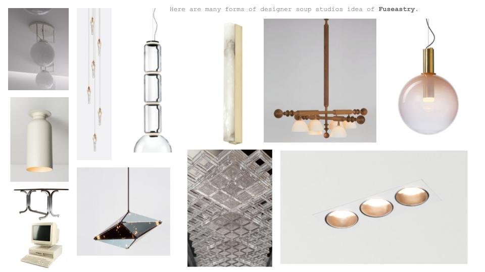
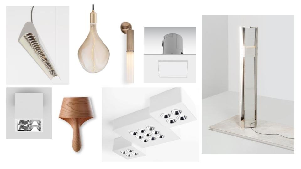
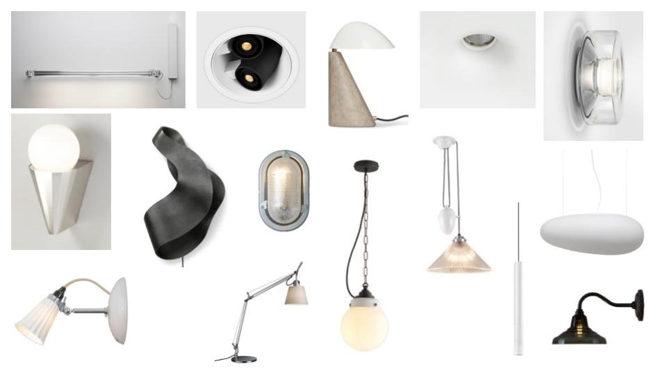
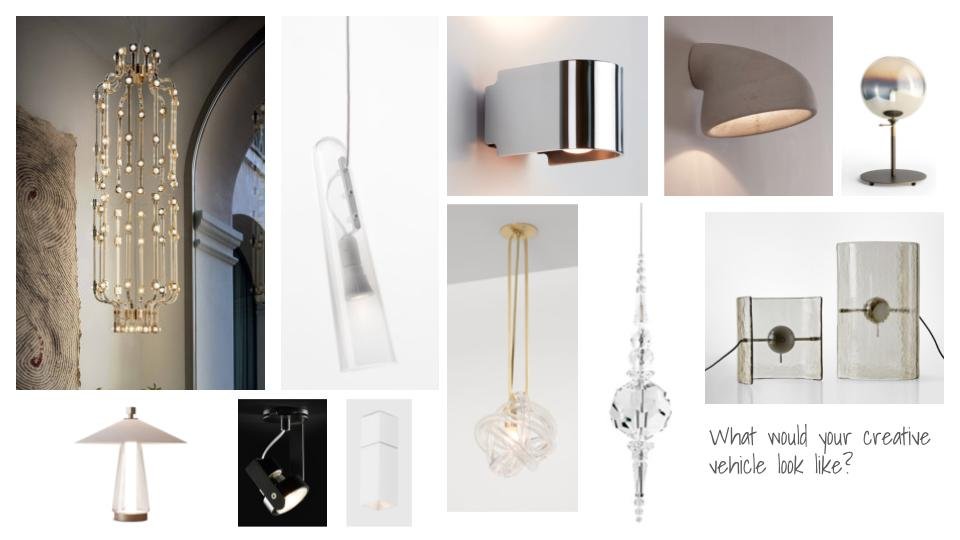
Broken down to size it is, the Future, the Sea, and Industry Arts. These three components encourage a design that takes the farthest thought in your human mind, and the newest thought in your human mind and creates a space for both of them to sit next to each other. It’s more than old and new, because it’s a subjective experiential gesture, a 1:1. It is because you are pulling from your own deep personality of what is and was and will be conscious to you (not the scrolls of doom). Some of these thoughts ask us to use memory and hone in on objectively what the sea is. It is a vast, nurturing connectedness that at its deepest parts, we have not even been or know. The trenches. Industrial arts is how you create a mode or operational plane to use in this deeply personal vehicle of design you are generating. We all have been charmed by the crafts of industrial craft. What one resonated with you as a child? As a teen, as an adult? What do you think would charm your future self? What is in you immagination.

This is my interpretation which is driven with a soft, pastel, feminine vehicle. So, working with me at designer soup, you can already know that if this is your style of vehicle too, we can immediately proceed with it and it’s going to be a pretty quick process to get an initial concept. Your design choices can quickly become like an analogy of choosing a friend group. You are the sum of the circle you surround yourself with. It’s the influence! So, what do you value? Your friends probably share those values too. You can ask the same with your design choices. So, think about that when you are thinking of your surroundings. Personally, I’m kind of a lone wolf. I have a small group of friends that are in a diverse range of other groups. So, my style of my interiors is very strongly me, and secluded, but it is diverse in its tastes. Our friend groups change as we grow, mine certainly have. So, you will outgrow some of your surroundings, this is natural. But, you are always connected to your values and memories (the sea), and openness to new things (the future) and your current vehicle of style you authentically choose to surround yourself with that is connected to both of those things (industry arts). Industry arts is what we purchase, the materials. The lines and shape is pulled up from imagination or memories, the past and future. The present is what you choose to bask the lines and shapes in to create form with a color palette and available materials. Which gives them their zeitgeist, or current shading that gives a true form.
Zeitgeist: The defining spirit or mood of a particular period of history as shown by the ideas and beliefs of the time.


Color Predictions for 2023
from Designer Soup Studio’s consideration and perspective

When the nights get darker faster and the mornings shine brighter, it always is a perfect time to reflect. For me, I always get these hunches. Some are fleeting but some continue to ring in my head constantly and consistently. Now, I realize that these feelings and hunches are my design intuition and I should share them, brilliant, haha! Over the past handful of years my hunches are scary accurate. “Scary, or cool?” Someone said to me recently and that changed my mind. From sheepishly sharing my thoughts nervously, to giving a full-ass color range of variations with genuine descriptions I believe the collective will come to love (hopefully).
From the Beige Reign— still clutching onto our hearts + never knowing when it will let go— to the Dusty ‘Clay’ Purple that emerged when we were all tucked away indoors for a length of time— I had a conscious hunch about those damn colors! So, without further or due, let me introduce you to my predictions! There are 18 different color picks. They are diverse in their nature, the juxtaposed will harmonize just take a look.
Here they are with a little explaining on what each color is, as I have named them, as well with the feeling I had when making the election. Enjoy!


Tannin Berry. This I believe will be the STRONGEST color prediction for me. My feeling/intuition keeps getting pulled over, and over and over again towards this color. Specifically the feeling of drinking a dry red wine outside next to a fire, or something of the likes. Feeling pulled inward, introspective dreaming, having a deep thought or conversation with someone or even self reflecting. It’s thinking of deepening topics with ambition to really act on them; fuzzy and warm. Confident because of what you’ve gone through. That’s Tannin Berry.
Sweater Hug. I was debating whether to name this particular color ‘Favorite Sweater’ or Sweater Hug. I went with Sweater Hug because this is the color that I see radiating in my mind when someone gives you a hug; and you, or they, or both are in a sweater. It’s just cozy and it feels like this color. Calm, safe, happy. Just feeling openly content in the moment. Everyone pretty much deserves this feeling in 2023. That’s why I chose this color.
Soft Aura. True empathy with others. It’s just that simple. That is Soft Aura. This color pairs so incredibly well with earthy tones. However, when you pair it with a bright and bold you get a euphoric reaction. Like ‘Woah. Wtf did I just experience.”
Band On The Run. “…and the county judge who held a grudge. Will search forever more.” Freedom and escape, baby. This color choice highlights the unexpected force that is known as a generation. A band of sagittarian centaurs galloping towards the truth. Bold, unwavering, unforgettable. Blink and you will miss it, because they will not wait for you. Living in the exact moment and finding the answer on your own. Reckless abandon, that is Band On The Run.
Vanilla Porridge. It’s a classic but heavy on the bougie. Beige, but better. We are talking the vibes of beautiful flecks of vanilla bean present that elevate the experience. You know exactly what I’m talking about. It was intentional. It was purposely designed to impress you with more than just what it is. Always humble, yet graciously humbling others, that is Vanilla Porridge.
Lights Out. A confident decision. Zero regret. Stunning results. It’s resume even boasts: ‘Works well with others’.
Quantum Blue. The spiritual cousin to Lights Out. This color is like a guru, this color creates CEOs. Or could, but is busy conversing with extraterrestrials on the astral plane. This is a powerful color, and can come off as austere if you don’t know how to handle it well. But, for those who are open to the vastness of it’s presence— you either see grey or you see infinity. Like I said, this color wants you to succeed. You just have to be willing to let success in, that is Quantum Blue.
Latex Boots. A decision that you never though you could pull off turned best decision of all time. Turns phone on morning after and is going viral on something called ‘Diet Prada’. That is Latex Boots.
Velvet Grey. The feeling of this particular pick for me was a settee. Positioned by a large window for quite some time as; someone’s favorite place to be. Because of that this particular velvet grey fabric has a tinge of citron yellow undertone from the sunshine. There are too many memories locked into it’s appeal. Even replacing it with the exact replica, it will never be the same. Old, used pieces of anything that itself is vintaged with memories. That is Velvet Grey.
Not A Problem. It’s the color I imagine in my mind when I say ‘Not a problem’— and full heartedly mean it. You bring me so much joy and happiness that it really is, not a problem.
Candied Snaps. It’s more of a sensory experience, this color choice. I picture it accentuating a living space in accented ways. Bright gestured snaps of candied accents within the room. Looking at it somehow invokes a sweet tooth that is seemingly impossible, but true. The sensation of breaking a smooth thin piece of hard candy as a kid. That is what I see in this color, everyone’s inner child somehow. Small but significant, that is Candied Snaps.
Cocky AF. It’s healed years of trauma, and it shows. It looks good-as-hell and glows from the inside out. If I am being super open and honest. This is legitimately is the color of the leaves that surround the on screen environment in the movie, Pocahontas. Those leaves go hard AF. Wearing this color or utilizing this color? That’s cocky AF.
Pro Tip: Pair this with Band On The Run to get full experience .
Dumbledores Office. The level of celestial sorcery in this blue has me, personally, in a chokehold. And Taylor Swift has her Midnights album? The work is already being done in regards to the influential power of this particular color. Some might say, it is the greatest color of all time. Definitely not a crack-pot old fool. RIP Hagrid.
Dumbledores Robe. The influence of the Wizarding World and MinaLima Design is one for the record books. My intuition had steered me to the icon, the legend of style, Albus Percival Wulfric Brian Dumbledore. I am quite impressed with all of Dumbledores dress robes— however! His robes in the Prisoner of Azkaban. Yup, that’s the one. At that point in the series I said to myself, he is just showing off at this point. That costume was career height level shit and definitely makes this list.
1990 Avon. The pure relatability of this name, this shade, the grandmother and aunties whom we were given little white tube samplers from. It’s remembering an era in a fond way, a style craze, a beauty craze. There were other lipsticks in the sample box the reps had too, and they all were 1-2 steps to and from this shade, lol.
Cottage Core 4Ever. Any time humans are going through something, this color returns as the emotional support dog. Dreaming of green pastures and not a worry in the world. Connecting with nature. Cottage Core will never die, Cottage Core 4Ever.
Curious Green. Piggy-backing off of the Cottage Core vibes, is this green. Why is this green so curious? It’s an old encyclopedia collection living in a quite corner of a dimly lit library that has pothos vines reaching around the shelves.
Baby Bear. The honey undertone in this brown gave me a bit of a pinky-promise energy. It wants to swear to you that you will be friends forever. Bear cubs I found out actually are highly likely to be born in pairs. While the color immediately reminded me of a baby bears fluffy coat, the hypothetical pinky-promise of two cubs is the feeling I get from this particular color. What color would you pair a baby bear pinky-promise with?! I sound insane. But, I am free.
If you may have noticed there is an absence of yellow in the selections. Yellow tones show in a few, lightly. But, for some reason yellow was not showing up for me in my mind or reflection. I don’t know why entirely, but I do suspect when we see yellow it prompts us to be happy or cheerful. Unfortunately, prompts may be inorganic/authentic and I don’t think people wanted to be prompted or be made to feel like they should or need to be surface level happy. I know this seems a bit far fetch. I simply think people are sick of being told what to do. That is why in this color predictions list I intuitively went for colors that would stir up possible individuality . Like I mentioned earlier, there is a diverse group of colors here and it is all up to us in how we could chose to harmonize them or use them in our creative expressions and works. In the end, we will embrace what we are drawn to.
PS. Watch yellow be the biggest trend of 2023 [laughing out loud in thought of the irony]
Lighting Selection + Ceiling Height: Kitchen Version
I wanted to talk specifically about the kitchen lighting in this blog post; especially the peninsula and/or island area. Style selection choices in the examples are from my design opinion. The biggest topic would be when to pass on pendants in the kitchen. Simply because there is an island present in a space it is always first instinct, or a learned habit, to go straight to picking out pedants to go above it.
However, you want to take a note at that ceiling height first. Often, it will be a standard clearance height of about 7.5’-8’ high—an average ceiling height. Now, subtract the 36” high counter, then subtract on top of that ~30-40” of space between the counter top and where the bottom of the pendant would start. That maybe leaves you with a 24” top to canopy length for a pendant drop (hopefully the canopy is under 2” in depth, too). If the ceiling height is under 8’, you’ll end up having what I like to call a stunted pendant that looks like it should have more length, but does not have very much of a drop. The effect of the stunted pendant also takes part of another design downfall, and that is when it visually pulls the ceiling height down towards the ground. Due to the fact every bit of given height is being crunched together, the entire kitchen seems low now. The ceiling height is too accentuated, too squished, and now it seems even lower than it is because your eyes are visually being pulled down. On top of that, the pendants are missing either full aesthetic potential because they do not showcase a full natural stretch.
If this is your situation, try instead to use what is called a can semi-flushmout or flushmount of some sort of aesthetic. Doing this makes for a feeling of greater height, or at the least does not take any height away from the ceiling by depiction of our eyes. You still get your light source and light direction to the island or peninsula surface. flushmounts can also be a more affordable design choice (depending on who makes the light of course). Also, this style of lighting choice can be perceived as more of a gentle sophistication all due to the nature of its thoughtful restraint in design presence. The restrain in design is nodding to the generosity it preserves for the perception of ceiling height and gives the other parts of the kitchen design more opportunity to shine and be a focal point.

A.
This is a beautiful modern contemporary example.
See how the restraint in drop, size, and even color gives that gentle kiss to design reservation? You could have put a pendant here, yes, but what would you be taking attention away from? The simplicity in of itself draws your eyes even to the flush mount cans. So perfectly executed by CG Design Studio.
Just because the opportunity is available in design, does not mean we always have to take it. Take only what you need, and you’ll be surprised at how much comfort it truly brings. Im even talking to my fellow maximalists out there! haha.

B.
Here is an example rendering from my studio using this concept.
This project was a high-rise condo building with incredibly low ceilings. In the end they would be 7.5’, which is the lowest ceiling height clearance height for commercial code.
(In residential you can go even lower in certain spaces of the residence. Depending on the jurisdiction you are in. but it’s safe to stick with more clearance always).
In this option I chose to use a small frosted globe. One of my favorite’s by Flos, the Glow-Ball Ceiling Lamp.

C.
Shown in Contrast. I could see a pop of color here too; maybe a dusty blue.
As you can see, even the design firm above talks about using this exact method in their caption. The result is very successful.
Using this method, you can gain the same visual illusions that help aid in small spaces or short ceiling heights, incorporated within any design style.